2026
Sovereign: Designing the Position Opening Flow for Position Management App
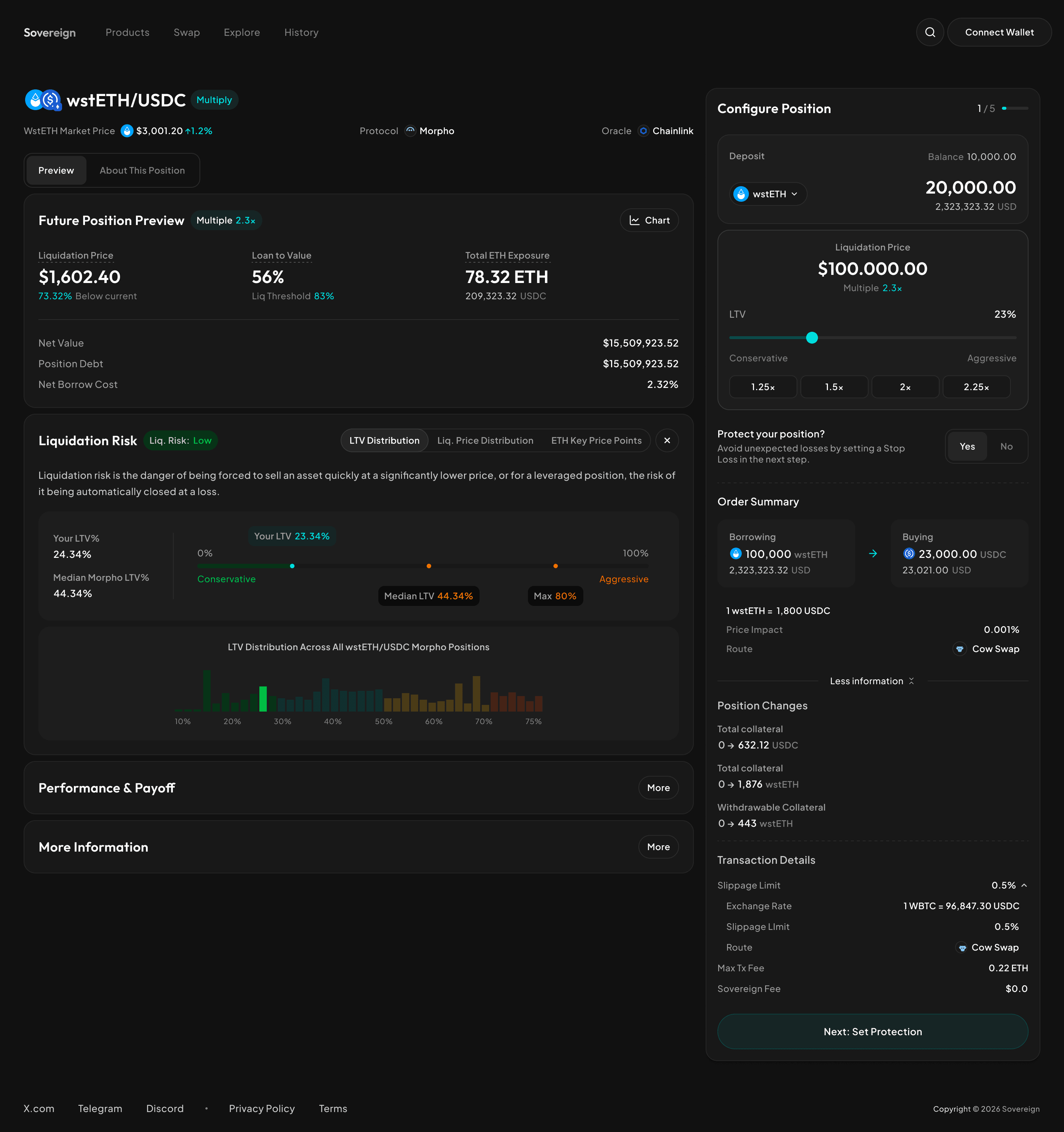
A DeFi position management app that lets users borrow, leverage, and earn across top protocols (Morpho, Aave, Sky, Maple, Spark, Hyperliquid) — with automations like Take Profit, Stop Loss, Auto Buy, and Auto Sell.
Results
TVL at launch
???
TVL at peak
???
Active users
???
3 core user frustrations
Fragmentation
Users visit each protocol separately with no unified view
Lack of risk visibility
Protocol apps don't surface enough information to make confident decisions
No protection
Markets move fast and there's no safety net
Core Design Challenge
Make people feel confident choosing and opening a position when there are many options and risks to consider.
Screen 1 - Product Finder
Users faced a flat table of 50+ markets with no hierarchy or guidance.
With so many variables to compare — liquidity, borrow rate, max multiple, oracle, automation support — knowing where to start was overwhelming.
Design Decision
We introduced featured cards at the top of the page to surface 3–4 recommended positions based on key criteria: Most Liquidity, Lowest Cost, and Highest Multiple. This gave users a clear, opinionated starting point without requiring them to understand every variable first.
Tradeoff
The full table remains below for power users who want to filter, sort, and compare on their own terms. The design serves two types of users simultaneously — those who want a quick recommendation, and those who want full control.
V2: Bring key information up front
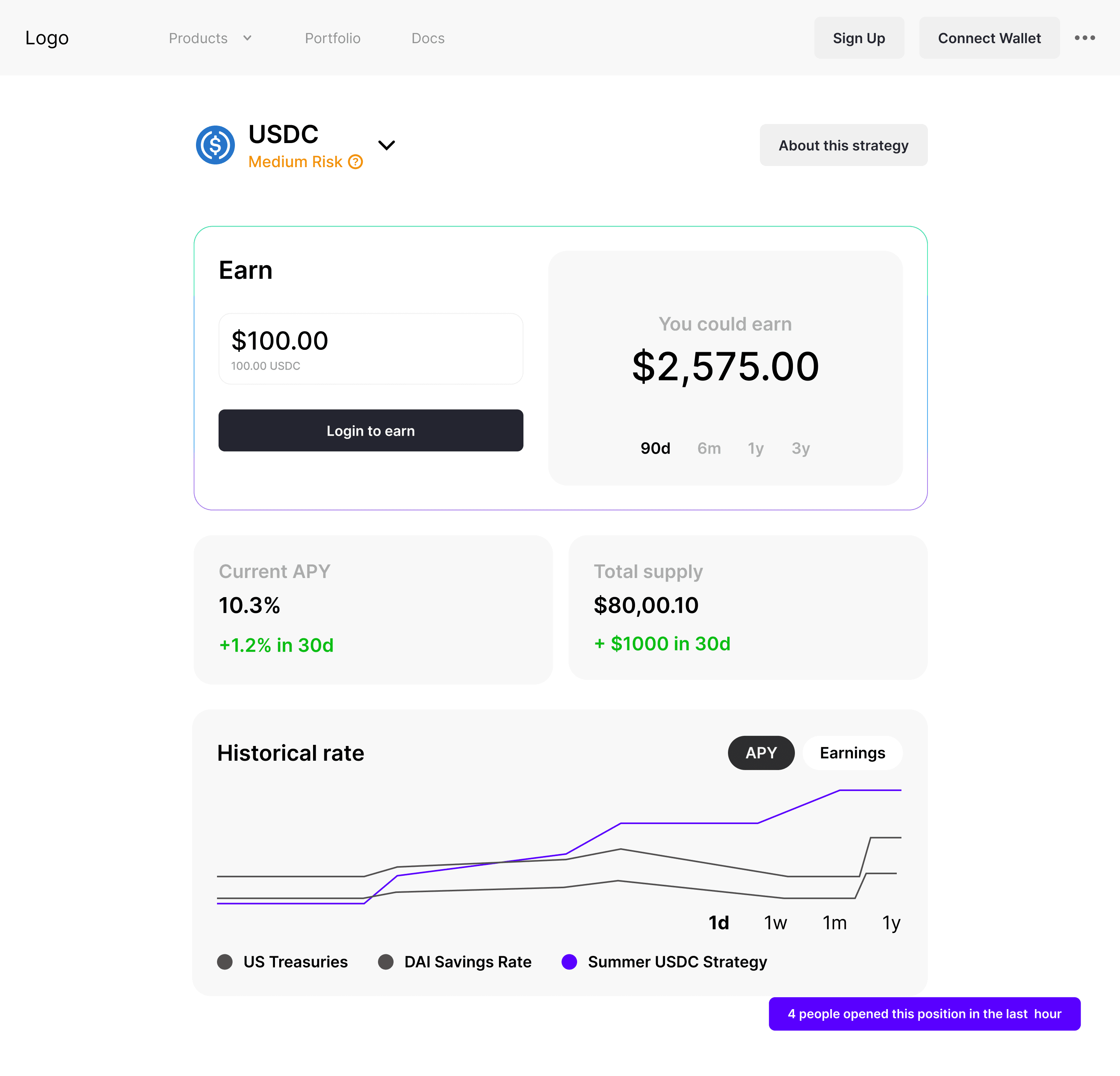
I moved the earnings simulator to the top and put key information (APY, liquidity, historical rate) right below it. So, users could see both the opportunity and the evidence on the same screen. The deeper details moved to a separate page.
The problem
Users who wanted the full details had to leave the page and lose their place. Fixing it for one type of user created friction for the other.
V3 & V4: User testing shows us something we missed
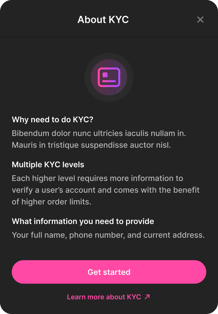
When we tested with fintech-native users, we found something unexpected: they didn't understand basic DeFi concepts that we took for granted.
For example, "no minimum amount required" — something obvious to DeFi users — was confusing to them. They thought they were missing something and hesitated at the deposit step.
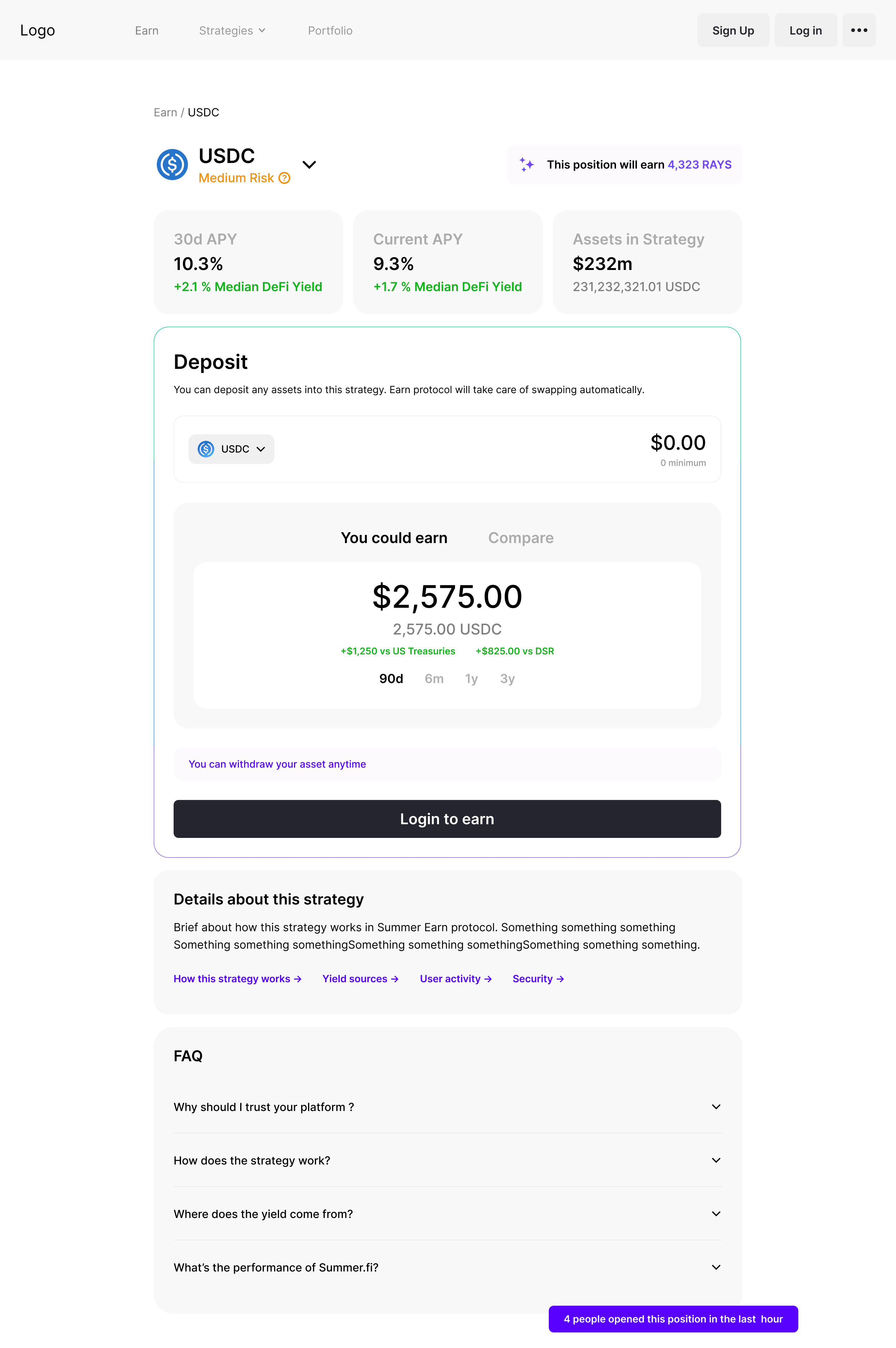
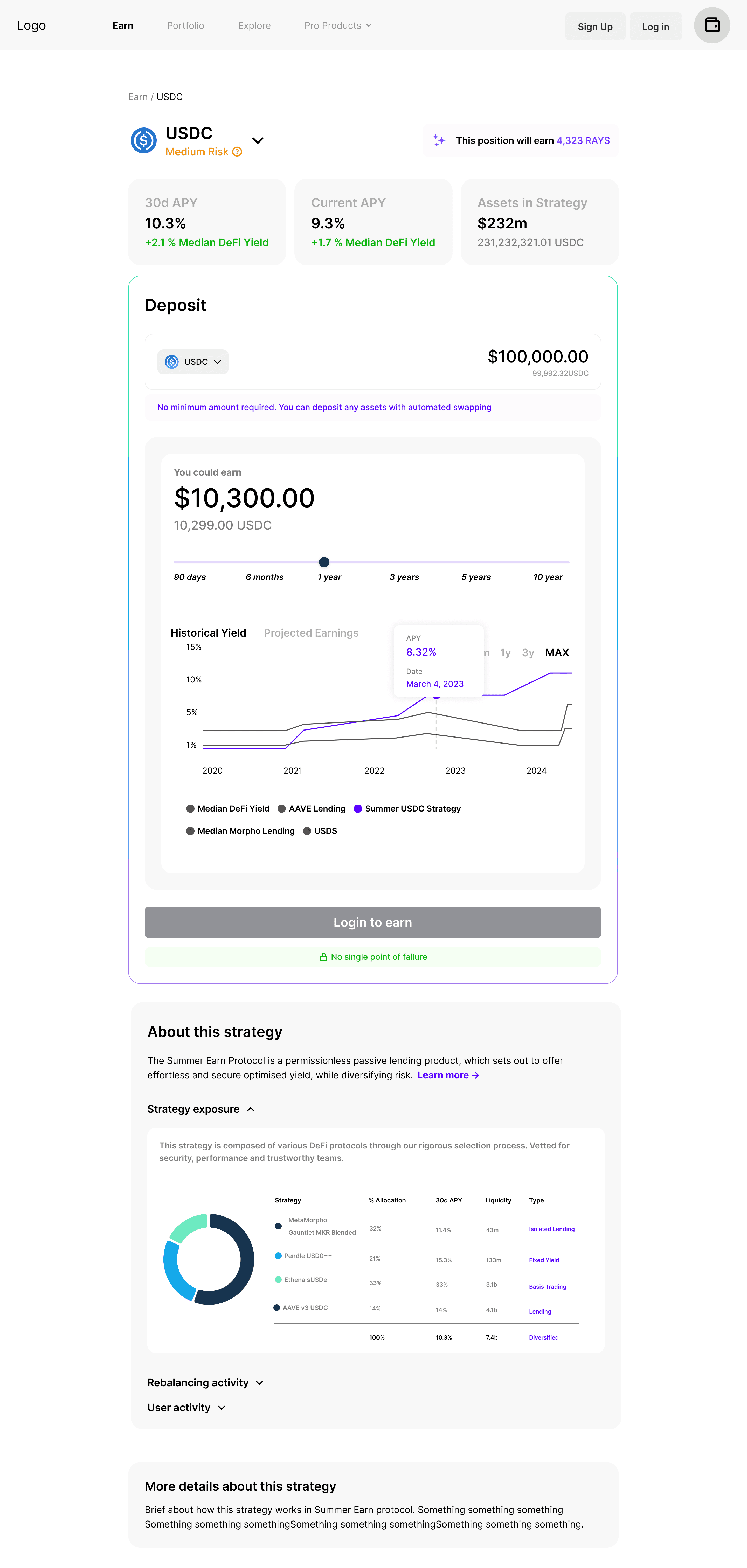
Two small but important changes came from this:
Added a short line of text below the deposit field: "No minimum amount required. You can deposit any assets with automated swapping."
Set historical yield as the default view in the simulator — because that's what both user types look at first when evaluating a financial product.
These changes came directly from watching real users get stuck — not from assumptions.
Final Design: Split the page into two clear jobs
The final design separates what the page needs to do into two areas: learn about the strategy (left column) and take action (right sidebar).
For example, "no minimum amount required" — something obvious to DeFi users — was confusing to them. They thought they were missing something and hesitated at the deposit step.
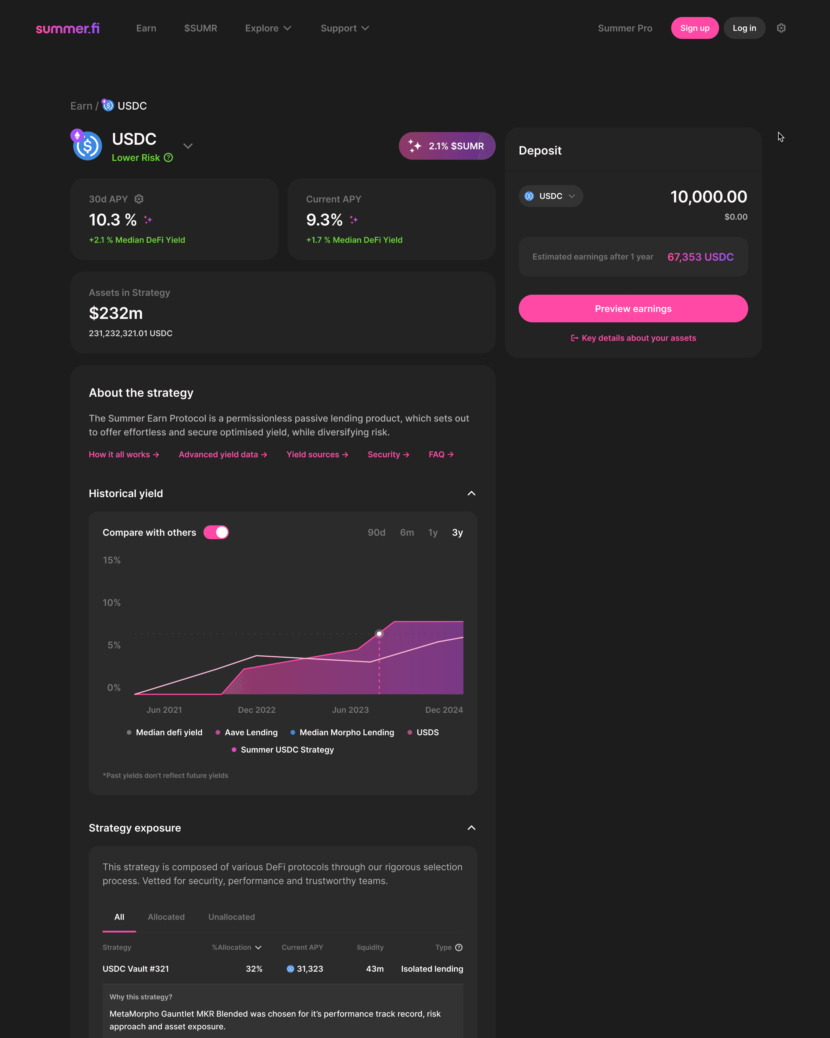
The sidebar (deposit input, earnings preview, and the CTA button) stays visible no matter how far down the user scrolls. The left column is organized by priority:
First: APY and total assets, which answer "is this worth it?" in a few seconds
Second: Strategy overview and historical yield (for users who want more context)
Third: Protocol breakdown, fees, rebalancing history (all collapsed, but easy to open)
DeFi-native users can open every section and read all the details. Fintech-native users never have to see any of it unless they want to.
Other key design decisions
Simplified the sign-up flow.
Sign-up works with passkey, Google, or a crypto wallet. Each option has plain-language instructions at every step. This removed the typical Web3 friction of connecting a wallet cold.